Interiors: the kitchen makeover part 1: sink and worktop replacement.
all finished space photos at the bottom of the post
I got the keys to my first place when I was 16 - a maisonette supplied by the council. I will never forget my first shop to Wilko’s to kit the kitchen out - it’s the room that has always been most important to me and even the cheapest vegetable peeler and grater bought me joy back then. When my whole world was in disarray I knew I always had the kitchen - a place to cook, organise and nurture.
In all of the rented places I’ve had over the years the kitchen has been frustrating to say the least - either too small, clinical or old and worn. With the cheapest worktops and stainless steel sinks than never seemed to look clean despite my best efforts. Over the years I learned how to remove and replace kitchen silicone and I tried DC Fix on work surfaces to hide black, shiny surfaces. So when I bought No. 7 I went to town pinning on Pinterest to figure out what my vibe needed to be for the kitchen.
The house came with a neglected kitchen - the tiles behind the sink were falling off, the laminate worktop peeling and rotting and the room smelt really bad from the grease and waste pipes. Somehow I managed to live with it for a few months while I ruminated on how I was going to sort it out. My kitchen is quite a large space made almost of two parts - the bigger space with the main worktops and cooker aren’t great but the part that was desperate was the sink area and the cupboards underneath the sink were buckling and rotting. I knew it could be a really special space but with little budget and having never replaced a kitchen before I was struggling to come up with a plan.
My original plan was to try and find some secondhand kitchen cupboards and do it all with reused materials and reclaimed wood but after a few months of scouring on marketplace and wood recycling places I still hadn’t found a solution that felt right. I’d found a sink and tap but couldn't fit that until I replaced the cabinets so I carried on using the kitchen, wincing every time I needed to use the sink area.
I don’t know at what point I decided to just have a crack at it myself. I guess because it was a small area I thought ‘how hard can it be to replace a cabinet and worktop?’. Of course, this is the trickiest part of a kitchen because the plumbing needs to be sorted but my sister said if I was confident with the carpentry side of things she felt confident with the plumbing side of things.
So, one rainy Wednesday in October we got cracking - it took us at least an hour to find the stopcock but once that was located we could remove the tap and sink and strip out the old worktop and cabinets.
THE BEFORE PHOTOS
The Moodboard
The planning
I knew I wanted a lived in kitchen, I love to cook and I love to have all my favourite things to hand. A few people have said to me that I have a messy vibe, I wasn't sure how to take that but then when I had a visit from an ex partner a few years back he said that he’s always enjoyed how I naturally make a lived in space look considered and stylish even though there’s a lot on display. I’m definitely not a minimal person when it comes to the kitchen! A lot of it comes down to my collecting tendencies - I really enjoy well made ceramics and woods and pick pieces up in places I’ve visited or on happy days with friends and I love to have these things around me.
With this is mind I knew I wanted to go for open kitchen - one with lots of shelfs, rails and racks. A lot of places for displaying the things I get so much enjoyment from. I’m not sure how long I’ll stay in this house, certainly for the next 5 years but beyond that who knows. But I do know that once I’ve done the makeovers around the house I don’t want to change much so I can focus on having time with my Mum (who was recently diagnosed with Alzheimer’s) and enjoy the space with friends. So I wanted to steer clear of trending colours and instead focus on the colours and textures that feel lived in and homely but also had longevity.
With colours, this room is north facing but has good light, especially in the summer so went for warm neutrals. I chose gold/brass accents for a touch of luxury and warmth.
cabinets & worktop
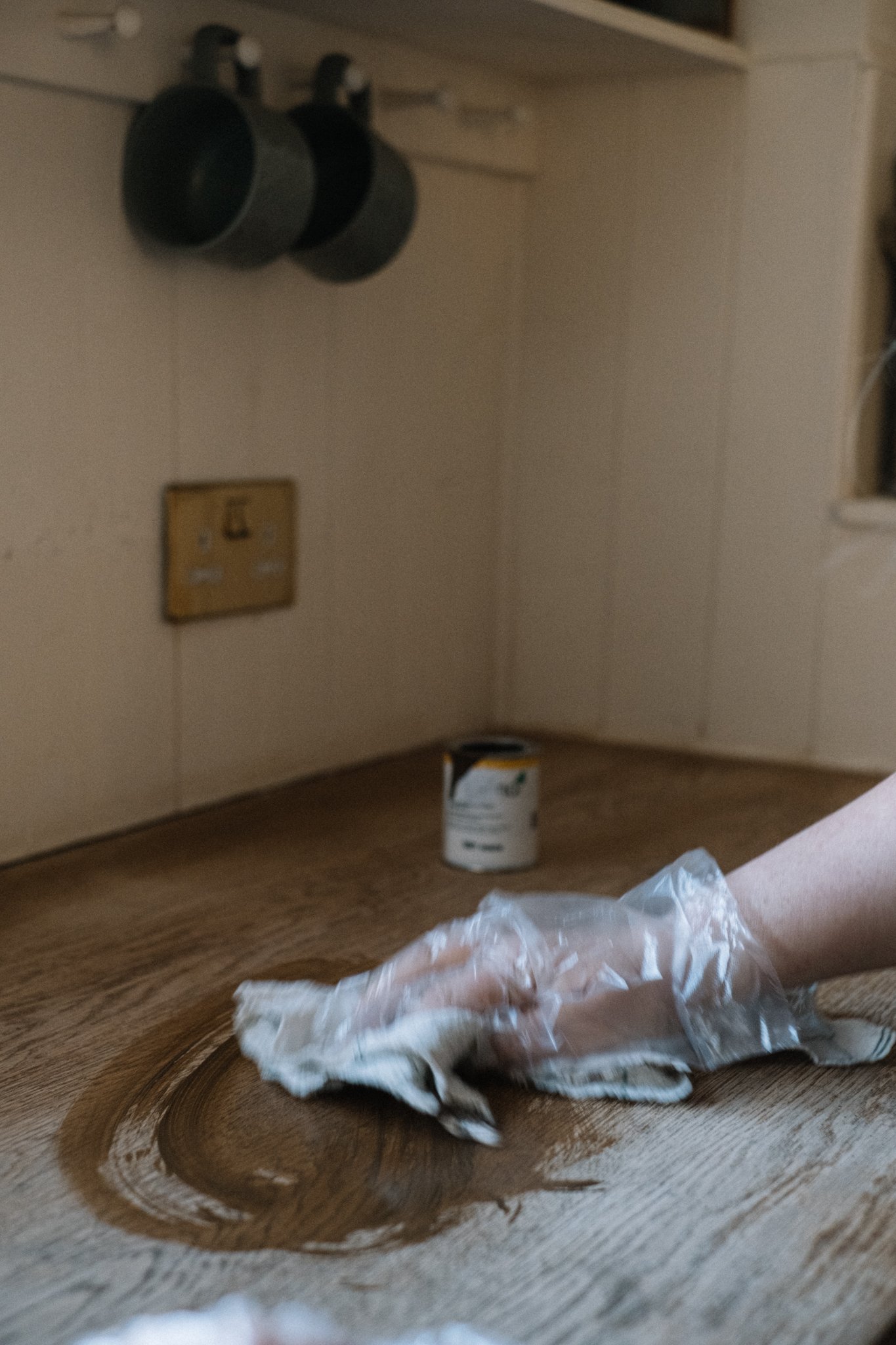
I chose the Metod cabinets and went for the Möllekulla worktop as having deliberated for ages it was the one that looked most like natural wood and that I could stain. I knew I wanted a darker wood and having used the awesome Osmo top oil in Acacia in the van I knew I’d be using it for the kitchen - it’s an incredible oil that is incredible hardwearing, food safe and doesn’t have orange undertones.
Fitting the cabinets and worktop took longer than anticipated - once we’d finally managed to build them from flatpack there was a lot of measuring and cutting out holes with the jigsaw for pipework. When it came to fitting the worktop somehow I’d managed to end up with a space where the worktop was to go exactly the same length as a longer Ikea worktop but I needed to cut out a hold for the sink so we turned the sink upside down and drew around it on a piece of sturdy cardboard. We then worked out the overhang by measuring from the edge of the sink to where the sink would sit on the worktop - we then went back to our outline on the cardboard and reduced the shape by the overhang measurements. We then cut out along this new line and then drew around it onto the worktop. This bit was teeth clenching and my advice would be to make sure you sketch it all out and measure and think it through a number of times making sure you are leaving enough around the sink for the worktop to have the strength you need on the slimmer parts. I then drilled a hole with a wide wood bit in the corners of the piece to be cut out and used these holes to place the jigsaw in places and got cutting - eek.
Originally I wanted green cabinet doors which I bought but once they were in they weren't sitting right with me so I painted them with Half Light, I feel like the colour makes it a much more cohesive and calming space.
Tools needed: screwdriver, drill, spirit level, flat wood drill bit (at least 20mm), jigsaw, circular saw if cutting down worktop length.
The sink and tap
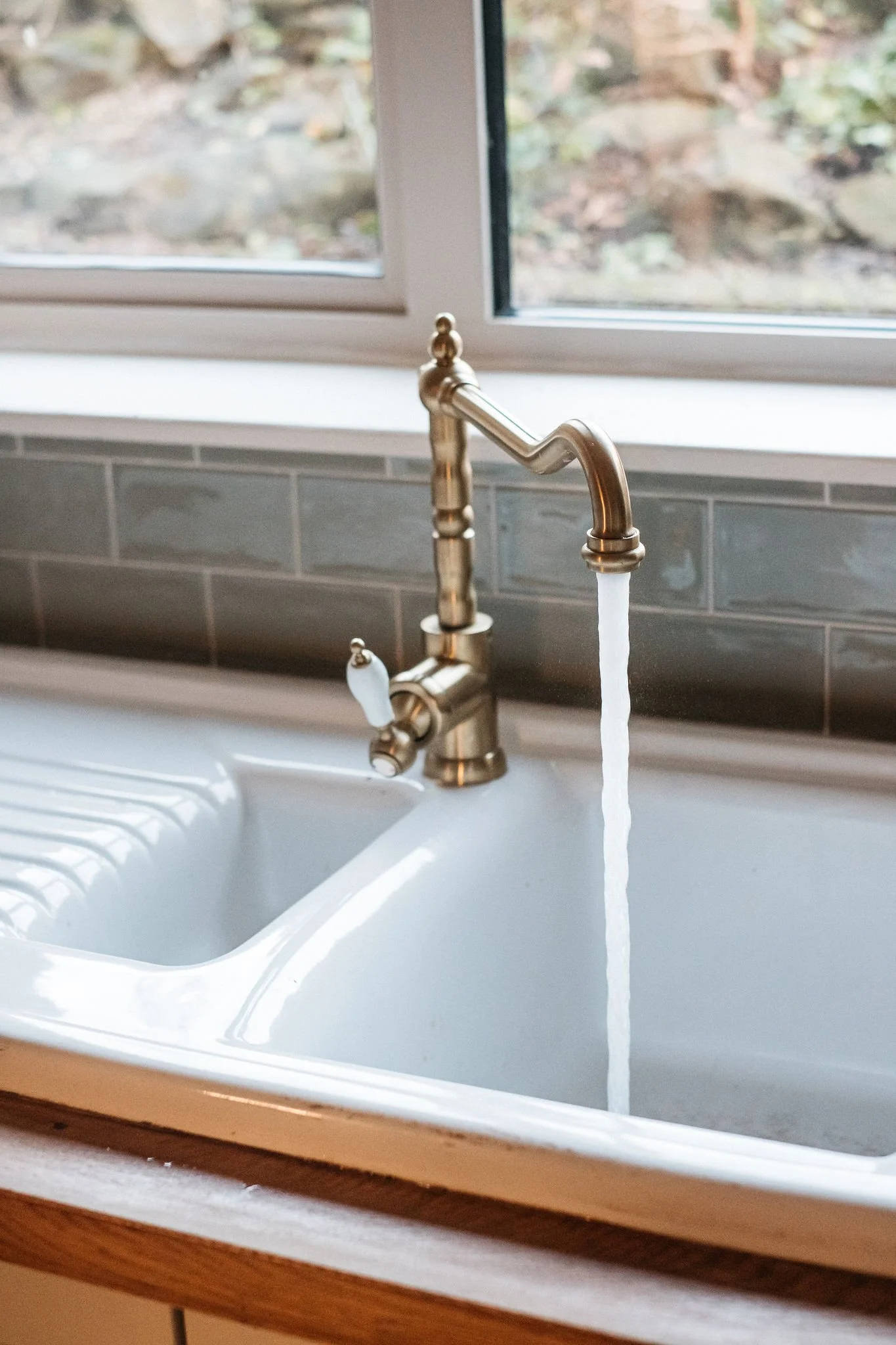
I knew I wanted a 1.5 ceramic sink (one with a small middle bit and a draining area) and kept checking Marketplace for the right one. The one I ended up with came up for very little money just a few mins down the road from me - so little I can’t remember how much, possibly about £30. It needed a good clean up and it was a nightmare getting their tap off that they’d left on (all the fittings had gone rusty) - so if you are buying secondhand I definitely suggest asking them to make sure all the plumbing is removed before you collect. The tap is an Ikea one that I bought off Marketplace for a fraction of the price - I just loved the brushed brass and the lever action which is so easy to use when you’re baking or cooking and have stuff on your hands you need to rinse off. The only problem is she'd obviously got it from bargain corner and it was missing it’s tails and some fittings so it was an additional cost to buy those and an absolute pain to fit so check if you’re buying second hand that all of that is in tact. Luckily I have an excellent plumbers merchant down the road who we got very familiar with that day!
Once the cabinets and worktop were in place we lowered the sink in - not before applying a generous amount of clear silicone on the underside of the overhang - and got to work on the plumbing. Because it was all a bit gross we just replaced the whole plumbing system under the sink - you can buy these as kits and once you work out what you’re doing it’s a fairly easy thing to learn with the help of YouTube. It was difficult for us because of the tap missing its specific fittings so it should be a bit more straightforward if you buy a new tap with all the correct fittings. I also had to buy adaptors to join the tap tails to the existing water supply which weakened the whole thing and we spent ages trying to sort a small leak - in the end PTFE tape saved our bacon. I highly recommend using this tape on all fittings for plumbing.
Tools: adjustable wrench, tap back nut spanner set (might come with the tap), standard spanner set, hacksaw to cut any pipes to size, spare washers incase any get damaged.
Boxing in the fridge
When I first moved in the worktop ran the while length of this part of the kitchen but there was nowhere to put the fridge so I decided I would shorten the worktop area and create a new space for the fridge. However, one morning I noticed some really beautiful light coming in on some boxes I had on the worktop where the fridge would be and didn’t want those gorgeous shards of light wasted by landing on a silver metal box. So that’s where the decision to box the fridge in came from and it was actually really easy to do. I bought a large furniture panel and cut to size using a circular saw. I then screwed it to the new worktop from the inside and then fixed it to the ceiling with two fixing blocks. I then caulked around all the edges where the panel met the wall or ceiling to give a smooth finish and used a bit of wood that I had in my lean to that fit between the furniture panel and wall perfectly to create a shelf above the fridge for trays and baskets.
tools used: tape measure, circular saw, screwdriver, drill, fixing blocks
tiling and windowsills.
I found the tiles on Marketplace for a great price - even though the tiles had stretched along the whole kitchen area before I decided to just create a backsplash with tiles and tongue and groove the rest of the area halfway up the wall. I also decided I wasn't going to retile the windowsills and look into window board options instead.
Removing the original tiles (before I fitted the new sink) was really easy, they came away with a wide chisel and hammer. I then cleaned down the whole area and got tiling. Tiling was suprisingly straightforward but I wasn't doing anything intricate, just fitting a fairly small amount of metro tiles to an inconspicuous area. I borrowed a tile cutter from someone and made sure all the tiles I need to cut were ready to go. It was then a case of spreading the adhesive on a bit of the wall and working quite quickly pressing on the tiles lightly using the spacers to make sure all the gaps were equal. I worked in thirds - so one third of the area I was tiling before moving onto the next third so the adhesive wasn't drying. The adhesive didn't take long to secure the tiles so I was able to remove the spacers after a few hours and I got grouting - grouting is so satisfying as it’s easy to work with and finishes off the tiles beautifully. I used ready mixed from Wickes with both the adhesive and grout.
For the windowsills I ended up using spruce furniture board from Wickes as custom windowsills are a lot more money cutting down to length with a mitre saw. I decided to go for spruce instead of MDF for its durability and natural texture but note how I treated it below in the cladding section as it’s really important. The depth was just right for what I needed and before fitting I sanded down all the edge to give a softer, classier look.
Tools needed: eye protection, chisel, hammer, grout applicator, adhesive applicator, tile spacers, mitre saw, tape measure.
Cladding and shelving.
There wasn’t even a question as to whether I would tongue and groove the kitchen - I’ve always loved the look and feel it brings to a kitchen. I decided to clad halfway up the wall and finish with a shaker shelf with hooks over the kettle area and a ledge around the rest of the area.
I deliberated on whether to go for MDF or softwood for ages but everything just went against the MDF - for one the production process of MDF is harmful and toxic (formaldehyde is also used to bind it), I love the look and texture of wood and it was cheaper to buy softwood cladding at Wickes than it was MDF. But I had seen spruce cladding gone wrong - the knots were leaking through paint and looked really messy. So do take heed of how I treated it as detailed below.
To fit cladding I worked one wall at a time so I could cut it all to size as I moved to each area without getting confused. My original plan was to batten the walls and fit the cladding to that but it would have made the walls too thick for sockets and fitting in my appliances so I used grab adhesive in the knowledge that shelves, hooks and rails fitted would provide extra secure fitting to the wall. I definitely recommend using a mitre saw for this - it will give you exact lines and mean you can get edges looking tidy and professional. You can hire one or use the Next Door app if you don’t have one.
On each area there would be a ledge I fitted a couple of brackets to the wall where the cladding was going to reach to before adhering the cladding to the wall. Around the plug sockets I used a jigsaw to make sure the cladding fit around the sockets tidily. I did unscrew the sockets so that I could tuck the cladding behind - make sure you turn your electricity off before doing this.
I used grab adhesive again to fit trims on corners and the ledge also before using screws to secure to the brackets I attached to the walls before cladding. I then put up the shelf as I would normally drilling holes. Once up I fitted a piece of wood between the brackets and measured equal distances to fit shaker pegs.
Once everything was fitted and secure I went around with decorators caulk (get at least 3 tubes of this as you’ll get through it quickly!) to tidy up gaps and create a smooth finish around edges and shelves.
With softwood cladding it’s really important to prime and treat the knots before painting - if you don’t the oil will leak and become unsightly. I used Ronseal primer and wood knot and it did the trick wonderfully. I then painted the whole lot in the same paint I had used on the walls: Rustoleum matt kitchen wall paint in Porcelain which is a gorgeous warm white which works so well in a north facing room.
Tools needed: tape measure, spirit level, mitre saw, screwdriver, drill, caulking/sealant gun.
Finishing touches
Once all the cladding was fitted and painted I oiled the worktop and then sealed all the edges and around the sink with sealant. I then started thinking about all the finishing touches.
I love the Hultarp rails in brass colour from Ikea - they are low cost and look really lovely allowing me to hang items I love in eyesight. I fitted one of these at the end of the sink. I then hung a plug in lamp from Dunelm that I found on Marketplace for a bargainous £6 towards the end of the sink, I adore it and it fits the style of the kitchen so well, so much so I bought another full price one for the other part of the kitchen.
I then stained a couple of frames from Søstrene Greene in the same Osmo oil as the worktop and added in a couple of bits of artwork I love including the Pink Pear from Emily Adlard which brings a contrasting pop of colour against the creams and beiges. I love these frames because they have glass in and look really gorgeous for a very small price. They can also be painted by removing the glass.
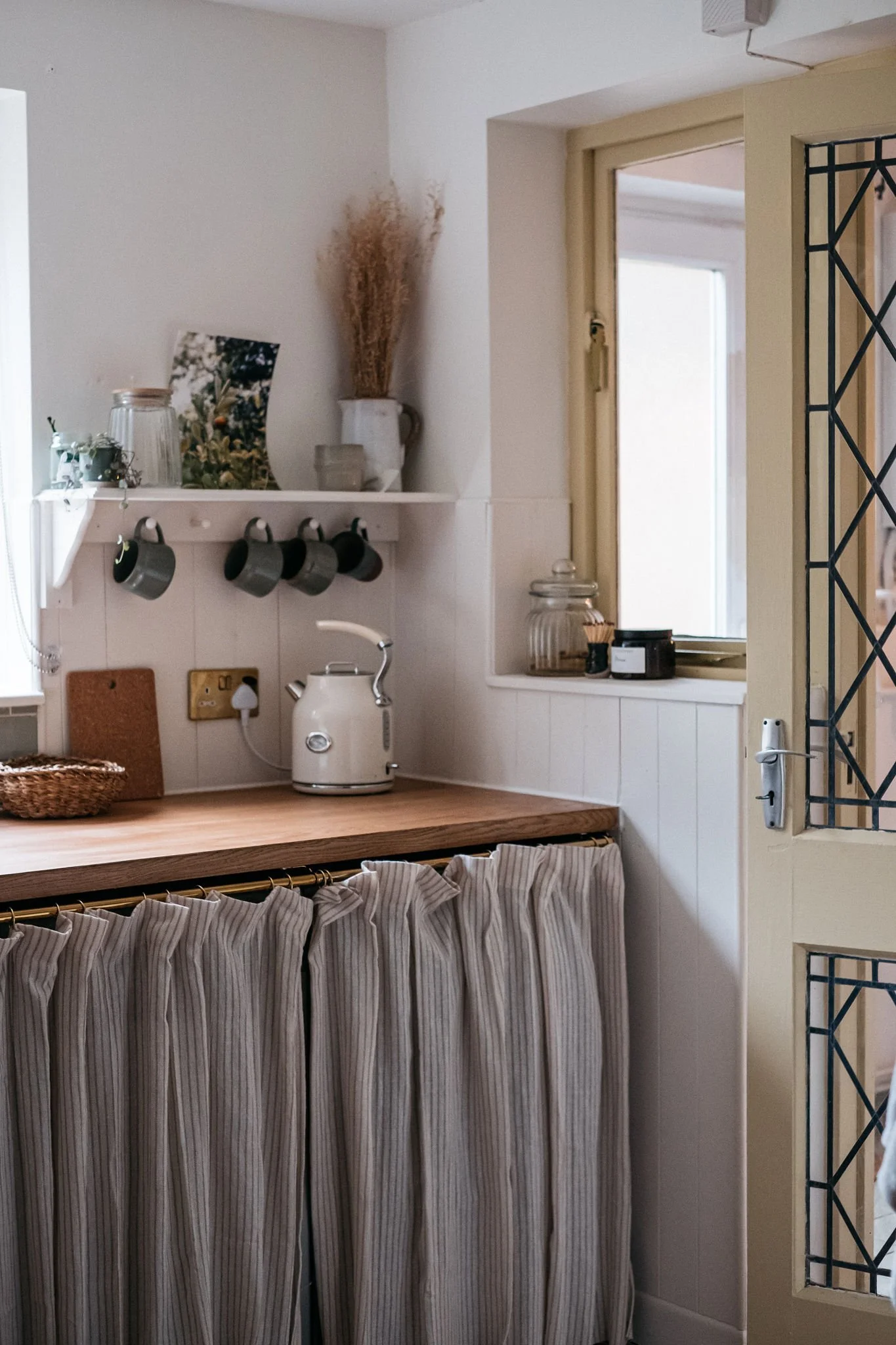
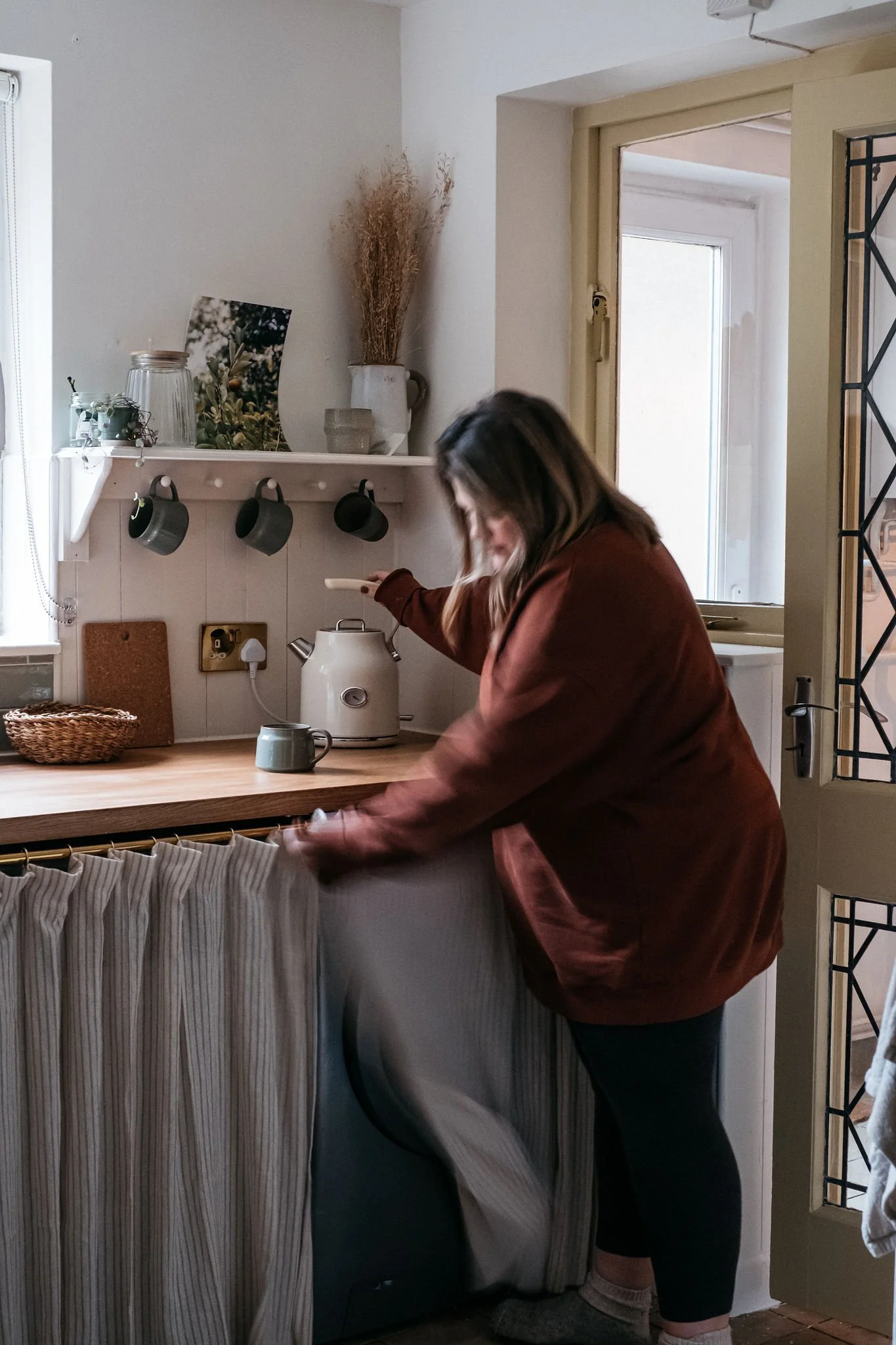
I then piled up some of my favourite mugs and ceramics - from Bel Holland, Silvia K, House Doctor and Broste - on the shelf and some special bits that mean something to me along the ledges.
The white UPVC window frame was jarring so after much deliberation I painted it with Rustoleum’s UPVC paint in Hessian. It was really easy to do and has made the whole window look so much nicer.
I then finished the whole area off by painting away the awful, dated floor tiles. Using Rustoleums floor tile paint in Warm Clay transformed the room - it’s not completely finished as I need to do the other side of the room but really happy with the colour choice.
With the lighting I bought a Habitat Coleman pendant light but smashed the glass by knocking it with a plank of wood. It was easily replaced with an Ikea Jakobsbyn glass shade in brown which actually looks beautiful - much nicer than the original clear glass.
Finally, I used more Hultarp to create a cafe curtain rail above the washing machine and dishwasher and hung striped curtains which has really softened that area. See my reel on it here.
THE After photos
Costs
As I’m finding with these room makeovers in the new house is that paint is a large chunk of the budget needed for a room. I’ve tried my best to catch all the costs, some are approximate as I’ve lost receipts/track!
I’ve included links where possible, some prices differ to the sale price as some items I got secondhand. All costs don’t include what I had already and tools/screws.
Materials
Metod cabinets and doors: £152
Worktop: £229
Cladding: £100
Trim and top edging for cladding: £25
Window board: £39
Shelf: £7
Tiles and tiling equipment: £50
MDF for boxing fridge: £45
Hardware
Tap: £30
Sink: £30
Sockets: £50
Shaker pegs: £11.40
Paint
UPVC Paint: £29.99
Floor Paint: £45.99
Wall Paint: £29.99
Door paint: £18.99
Sundries
Osmo Top Oil: £22.40
Plumbing: approx: £70
Grab adhesive & caulk: £15
Decor
Lamp: £6
Pendant light and shade: £60
Rails and hooks: £25
Curtains: £10
Frames: £15
Total cost (approx): £1116.76
Any questions about anything regarding the kitchen makeover, feel free to ask in the comments and I’ll do my best to answer. I regret that I can’t respond to any questions regarding posts via email.
There’s a pin it functionality on the images in this post, please feel free to add to your Pinterest boards by hovering your cursor over the image and using the Pinterest icon in the top left of the image. Please don’t use the images on this post for other purposes without my written permission.
Sharing is caring.
Save this for later by pinning to Pinterest. Hover over the image and find the Pinterest button in the top left corner.






A floor to ceiling DIY dark wood shelving and desk fitted unit with a retro 70’s aesthetic.