Interiors: Cheering up the kitchen with Atelier Ellis Block Print Yellow.
On the day I moved into number 7 I stood in the kitchen and felt overwhelmed. I’d convinced myself the kitchen was liveable and I could sort it out with a few low cost tweaks - and to a degree I did manage that. I replaced the whole sink area by myself as it a priority but it left the darker area of the kitchen as a ‘will have to do’. I replaced the worktop with a cheap IKEA one because the other was, for a want of a better phrase, done for.
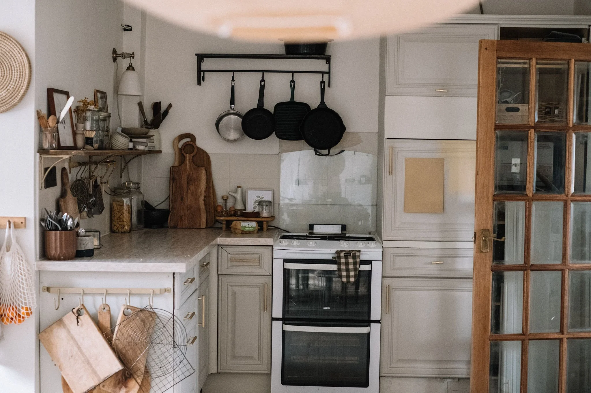
The kitchen has come a long, long way since the day I moved in. Made of two areas, my kitchen is large but awkward. The sink area sits in a small extension and the other part of the kitchen is the original - it means the oven is quite separated from the sink and I’m never quite sure where to food prep. Eventually I’ll look at it having a redesign, keeping the area I replaced but rethinking the original kitchen fittings.
In the area I’ve replaced I’ve replaced tiles behind the sink and cladded the rest of the area. I love it. But on the other side of the kitchen I’ve done my best with what I have to work with for now - I’ve painted, removed cupboards and replaced with an open shelf, built a new storage wall and painted all the cupboards, floor tiles and wall tiles. When I removed the higher cupboards I was really tempted to remove the tiles and clad with left over pine cladding I had. But my sensible brain took over and I had to talk myself into having patience as this side of the kitchen will be replaced in due course.
Instead, I did what I could and was happy with my temporary makeover. But something wasn't sitting right - light was bouncing about but I wasn't feeling energetic in the space. After taking a few photos I realised what wasn't right - the over all vibe was too grey. While I love my neutrals, I was finding the palette clinical and cold. I’d initially chosen a colour for the cupboard doors that I’d used in my last flat but in the north facing kitchen in this house it just looked grey and dull.
I’d known about Atelier Ellis for a while - a connection does their amazing photography - but I hadn't really taken much notice. But I was keen to find a new eco friendly and non toxic paint brand to use in the house as had some issues with a brand with a similar ethos. It just so happens it came up on my Instagram ads as I was deliberating paints for another project and I clicked through where I just felt deeply connected to the brand and their colours. I immediately ordered their colour cards and a few of their hand painted sheet samples and when I received the beautiful package through the door I immediately felt a kinship with the brand - the colours were all so classy and the way everything was presented was so special. I was itching to use the paints so they were always going to be the brand I turned to for my next project. I already had an inkling that I wanted something with depth on the cupboards and after much deliberation, hours on Pinterest and some time sitting starting at the kitchen I whittled it down to a deep plum, rose or yellow and knew Atelier Ellis would be my go to for them.


The sample sheets sat on the cupboards for a good month - I moved them round daily and tested each colour in different light. After a particularly productive day in the house where the April weather bought an array of light types through the kitchen, I made a final decision on Block Print Yellow.
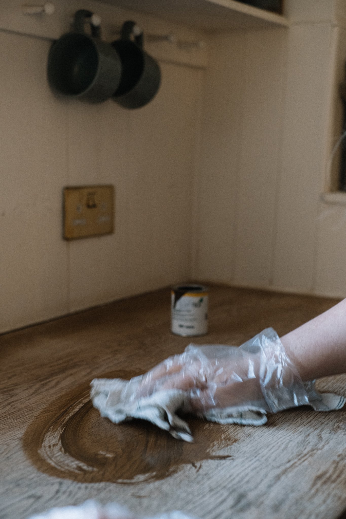
The recycled and recyclable tin came through a few days later in cardboard packaging throughout. The tin sat in a cornstarch bag and looked so pretty with its label I almost didn’t want to use it. I’d previously painted the kitchen cupboards with a specialist kitchen cupboard paint that had a primer in so apart from sugar soaping I didn't really need to do mush prep otherwise.
I had ordered the True Eggshell for this project. Atelier Ellis paint is bio based with a natural based binder resulting in a breathable paint with virtually no VOC’s (read more here). The brand is fully transparent about what’s in their paint and the proof is in the pudding - the paint had virtually no smell and I didn’t get the fuzzy head I usually get with other paints.
The paint itself was an absolute dream - easy to use with no dripping off the brush but of a consistency that glided on. I can honestly say this might be hands down the best paint I’ve used.


Block Print Yellow is everything I had hoped it be - cheerful but managing to sit with a neutral palette with grace and ease. The paint finish is smooth and flawless and it’s given my kitchen the injection of colour it needed without being in your face. With the mid century dark woods of my dining area it manages to look both retro and contemporary at the same time.
I nearly didn't write this post because my tiles need painting again (also too grey) but I’m trying to embrace showing the imperfect. So here it is - my refreshed kitchen. When the oven side of the kitchen does get replaced I will definitely keep this colour as it’s sublime and makes my morning every morning.


What do you think? How would you use Block Print Yellow in your home?

Pin me!
Simply hit the Pinterest logo on the top left corner of the image when you hover for later inspo.


A floor to ceiling DIY dark wood shelving and desk fitted unit with a retro 70’s aesthetic.